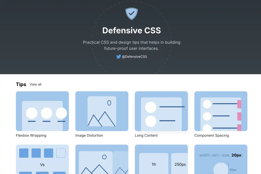
Defensive CSS
Educational resource and collection of CSS snippets focused on building future-proof user interfaces that handle dynamic content
Curated list of websites
Looking for a front-end UI framework or coded components? We've compiled a list of the best Front-end UI libraries. Elevate your web development process with these top picks. We cover top UI component libraries like Tailwind UI, Chakra UI, React Bootstrap, shadcn/ui, Vue, and more to help you choose the best fit. Find the open-source or paid UI framework or component libraries from the list
Resources in this category
Educational resource and collection of CSS snippets focused on building future-proof user interfaces that handle dynamic content
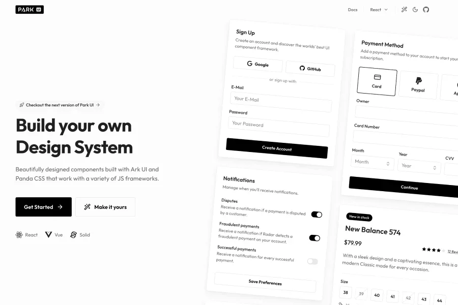
A design system component library built on Ark UI and Panda CSS—supports React, Solid, Vue and lets you install only the parts you need
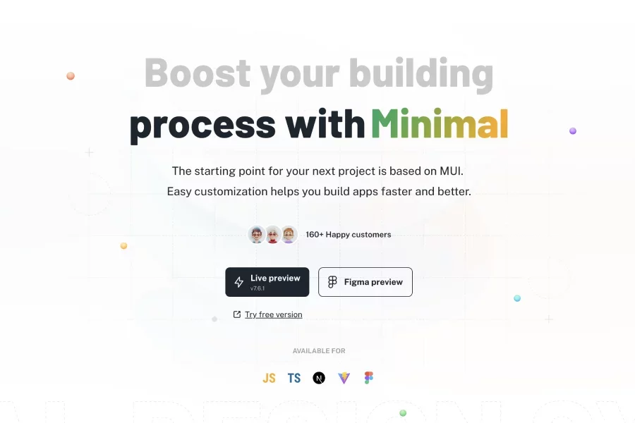
React UI kit and admin dashboard template built on top of the Material-UI (MUI) framework. It offers a comprehensive design system with pre-built components for both Vite and Next.js
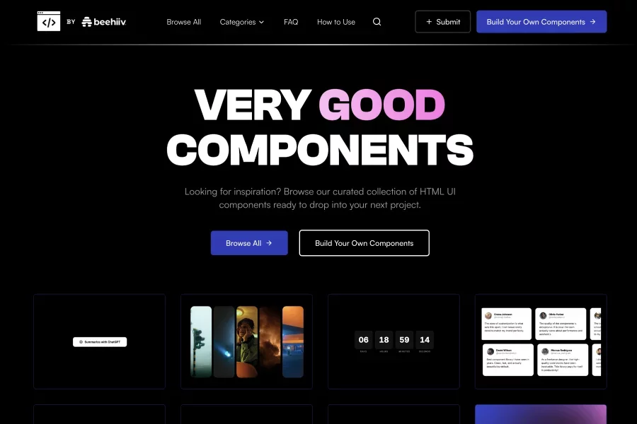
Interactive elements including sleek buttons, magnetic hover effects, liquid animated backgrounds, and expanding image galleries that can be easily integrated into modern web projects.
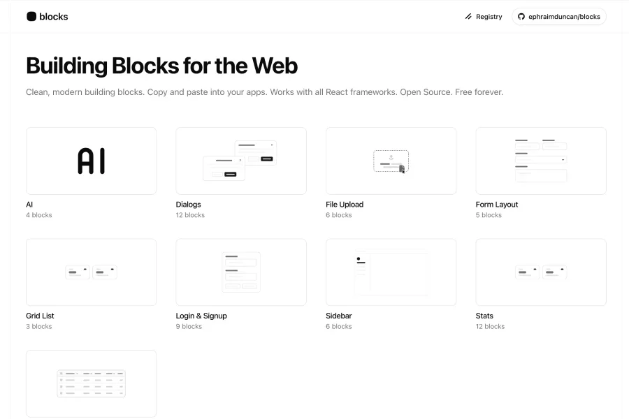
Clean, modern building blocks for the web - copy & paste into your React apps, works with any React framework. Open source. Free forever.
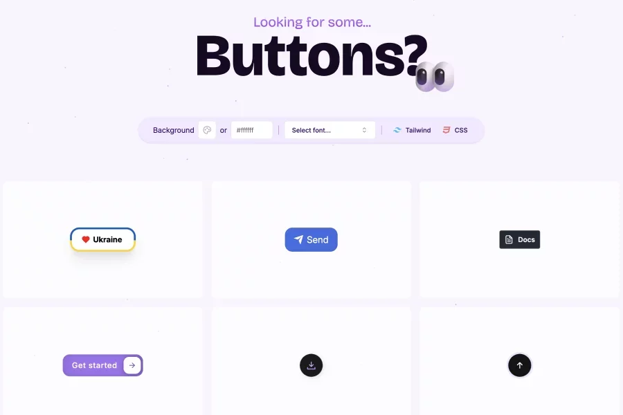
Collection of stylish CSS button styles with code you can copy made for plain css and Tailwind. Get the code you need to enhance your web projects.
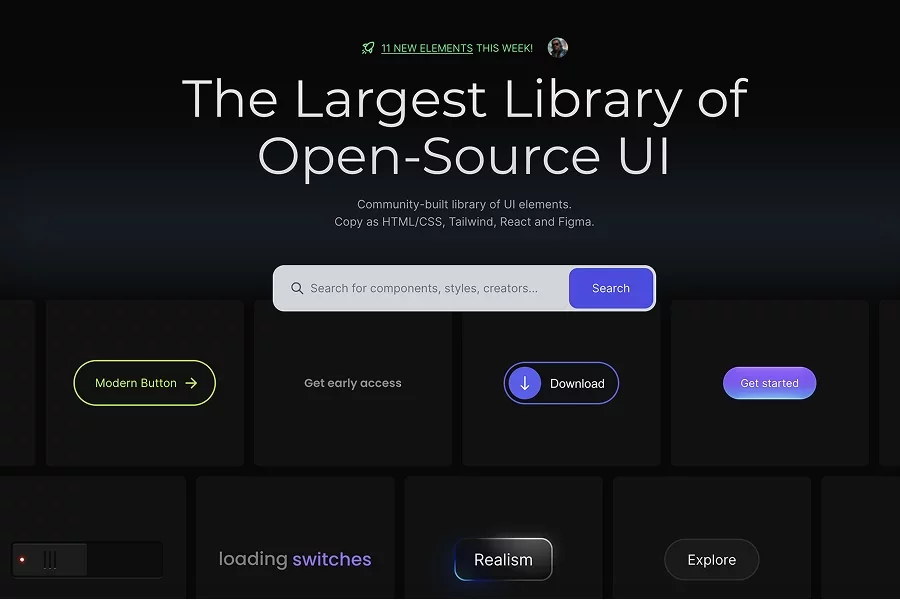
UI elements made with CSS or Tailwind. It’s all free to copy and use in your projects. Enables designers & developers to drop ready UI components (buttons, cards, loaders etc.) into their workflows
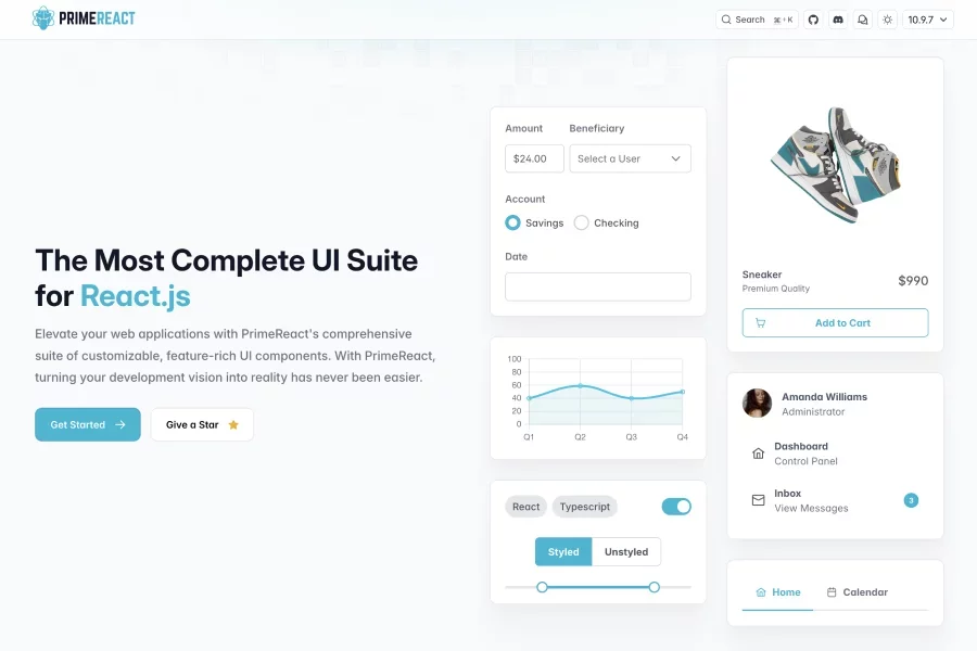
React UI component library: provides 80+ customizable components, theming support (styled & unstyled), and utility blocks to build UIs quickly.
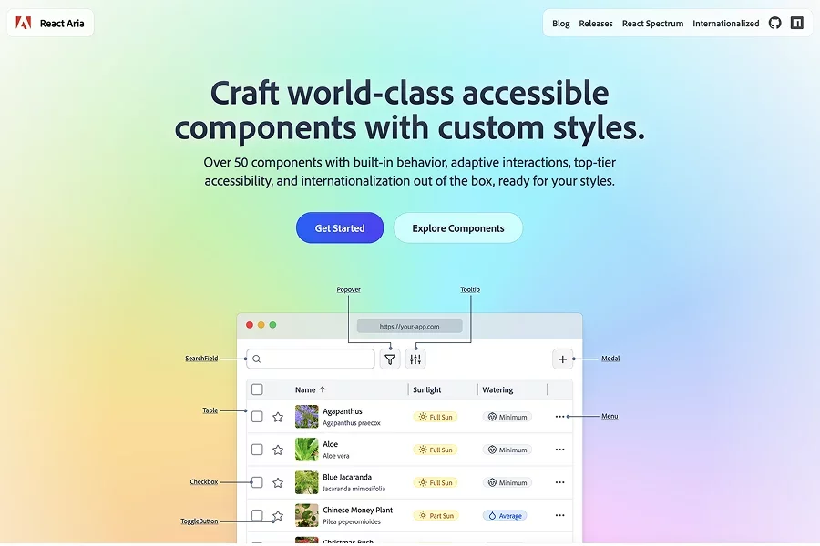
A library of unstyled React components and hooks that provide accessibility, behavior, and logic without styling... Includes over 50 UI primitives with built-in adaptive interactions

A Svelte port of the shadcn UI library: offers beautifully designed, accessible components and a code distribution platform, open source. Build UIs faster by copying component code into Svelte apps

A library of shadcn/ui components, blocks and templates designed to accelerate UI development. Includes a theme-generator and seamless integration with React + Tailwind
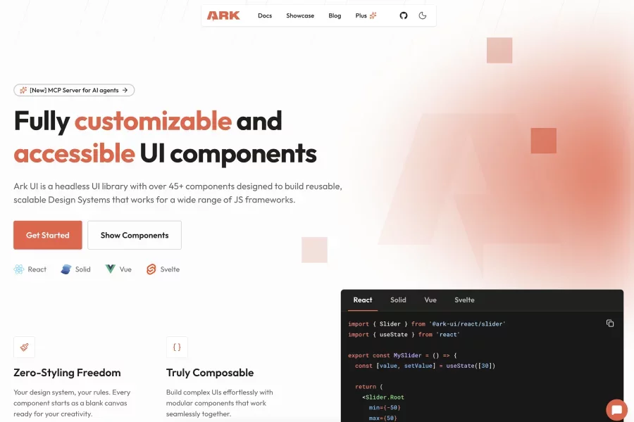
A headless UI component library with 45+ components, offering “zero-style freedom” (unstyled) for you to apply your own styling, framework-agnostic.
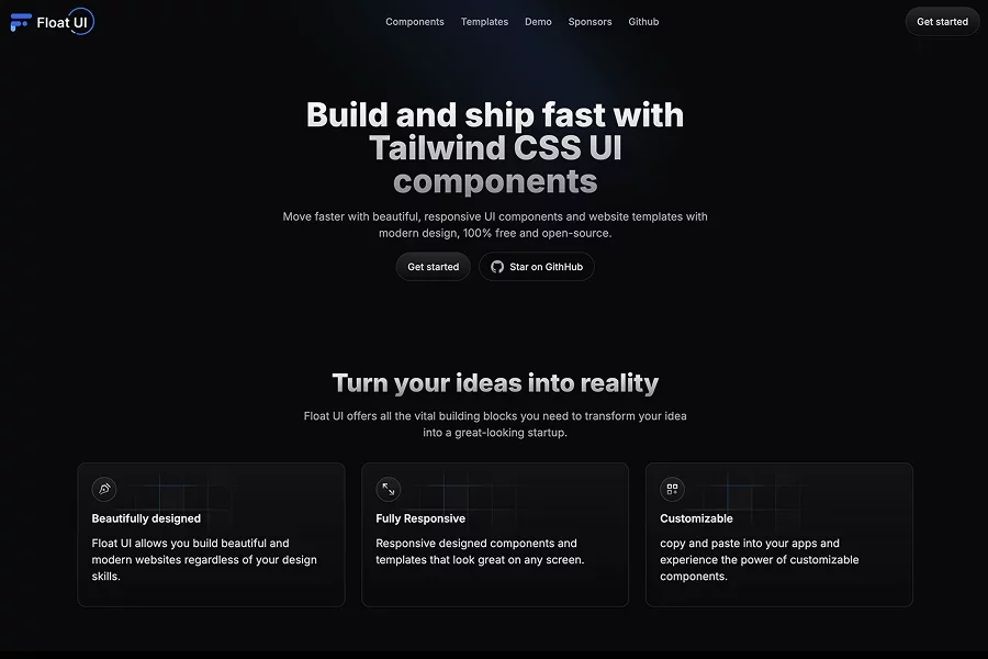
A collection of modern UI components and website templates built with React/Next.js + Tailwind CSS, offering both design & dev building blocks. Supports multiple frameworks (React, Vue, Svelte, Alpine)
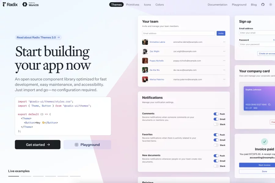
Unstyled, accessible, open source React primitives for building high-quality design systems and UI components.
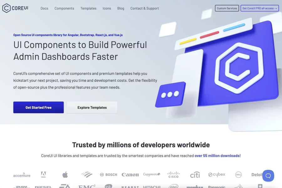
Open source UI component library and templates aimed especially at admin dashboards — supports Bootstrap, React, Vue, Angular, etc., with customizable components.
Library of copy and paste components to illuminate your applications with elegance and sophistication. Build fast. Ship with style.

A React component library built with Radix + Tailwind CSS, offering headless, themeable & accessible UI building blocks. Also has design system / Figma assets so designers and developers share the same components.
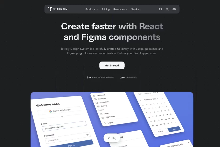
A design system & UI library for Figma + React, offering usage guidelines, a Figma plugin, and customizable components. Focused on design tokens, auto layout, nested instances, and making the handoff between design & code smoother.
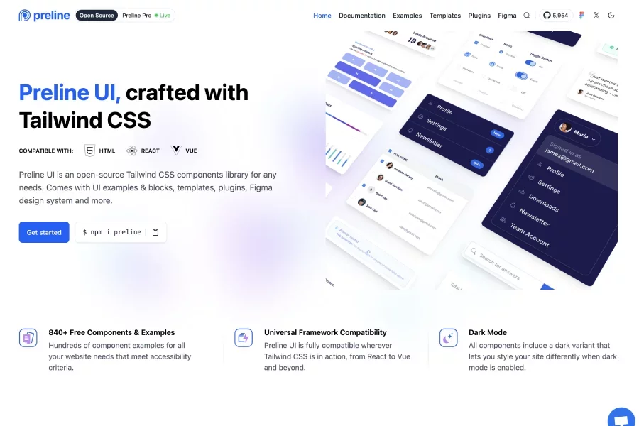
Open-source Tailwind CSS component library with UI blocks, templates, plugins, and a matching Figma design system. Supports HTML, React, Vue; includes dark mode, many component examples, and “Pro” plugins / templates.
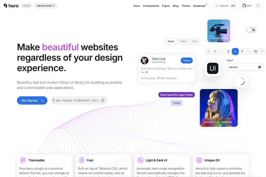
A modern React UI library built with Tailwind CSS + React Aria, focused on accessibility, theming, and developer experience. Components are customizable, type-safe, light/dark ready
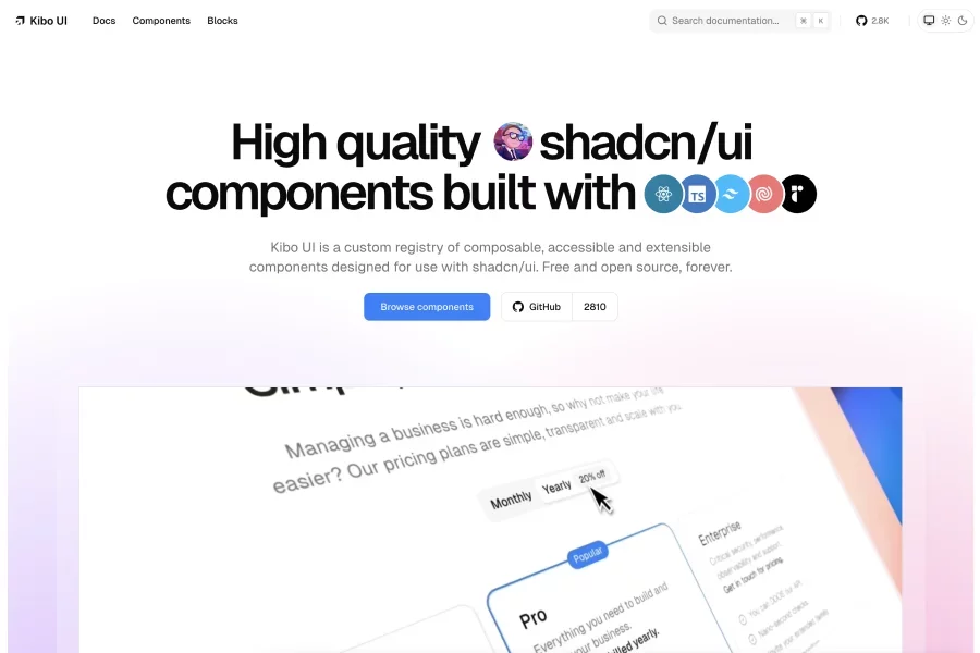
A registry of composable, accessible UI components designed to extend shadcn/ui, built in React + Tailwind CSS and open source forever. Includes blocks & components like color pickers, dropzones, QR code, etc., designed to work with shadcn primitives.
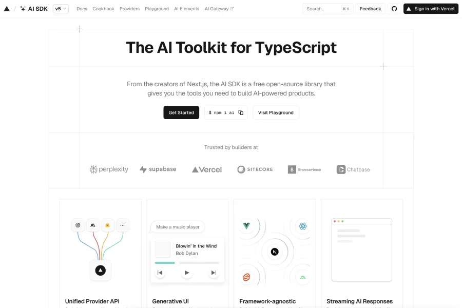
An open-source TypeScript toolkit from the creators of Next.js to build AI-powered features, UIs & agents (cross-framework: React, Vue, Svelte, etc.). Offers unified provider API, streaming support, and abstractions so you can switch LLMs without rewriting major parts.

A React component library offering a suite of UI components like Text, forms, etc. for building applications
![Arco Design [🇨🇳China]](/uploads/resources/arco-design-china.webp)
Open source enterprise-level product design system powered by ByteDance. A modern design system & UI component library with theme configuration tools and style variables.

An open-source, Tailwind CSS component library optimized for building high-converting UIs; includes plug-and-play elements suited for modern workflows. Supports Figma integration, theming, and many reusable blocks for marketing, dashboard, web apps.
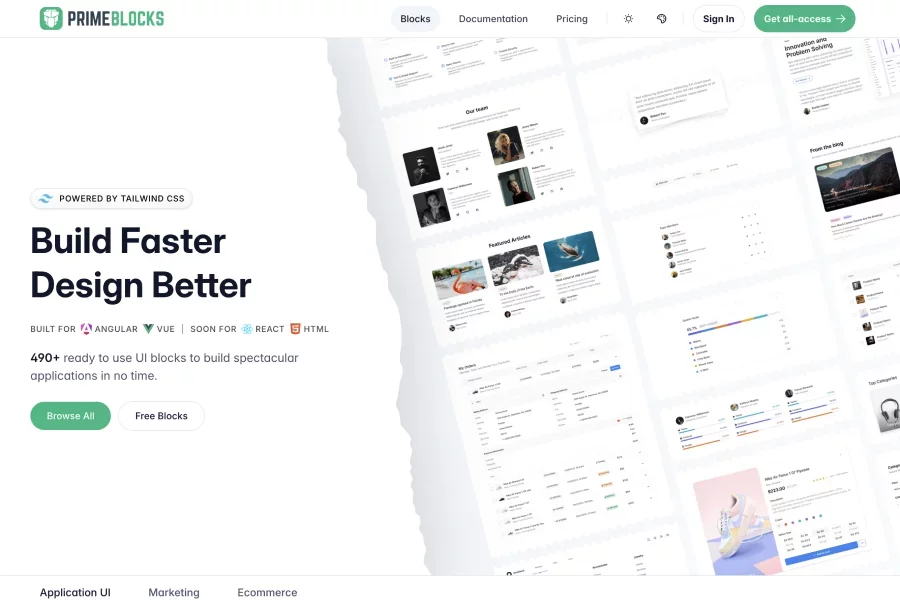
A library of ready-to-use application shells, sample pages, list views, and data display elements for building responsive web apps. Works in conjunction with component suites (e.g. PrimeVue) to speed layout & UI construction.

A next-generation UI component library for Vue.js with 80+ customizable components, built-in theming, accessibility, and support for styled or unstyled modes. Also offers 500+ predesigned UI blocks and templates as building starting points for apps.

A library of production-ready UI “blocks” (charts, forms, layouts, KPI cards etc.) built on top of Tremor components, ready to copy & paste. Each block supports light/dark mode and is customizable via Tailwind CSS

A React + Tailwind CSS UI component library providing 35+ open-source accessible components for dashboards and charts. Designed to help you build data-driven UIs quickly with production-ready components.
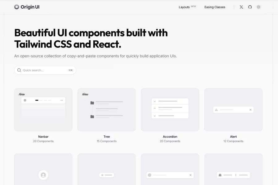
Beautiful UI components built with Tailwind CSS + React, offered as copy-&-paste building blocks to speed up app UI development. Open source, with hundreds of prebuilt components ready to drop into your projects.
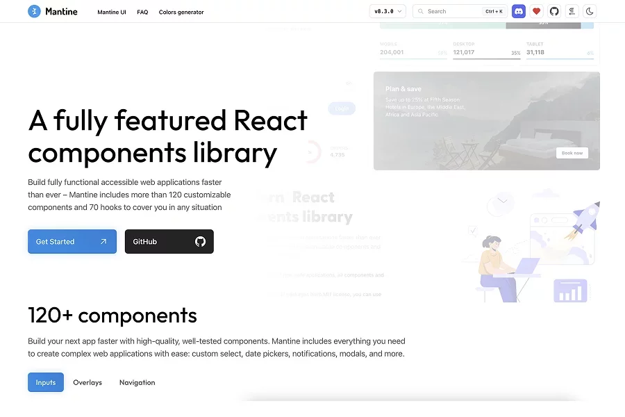
A React component library with 120+ customizable components + 70+ hooks, designed to help build accessible, high-quality web applications faster. Includes built-in theming, light/dark mode support, and strong developer experience focus
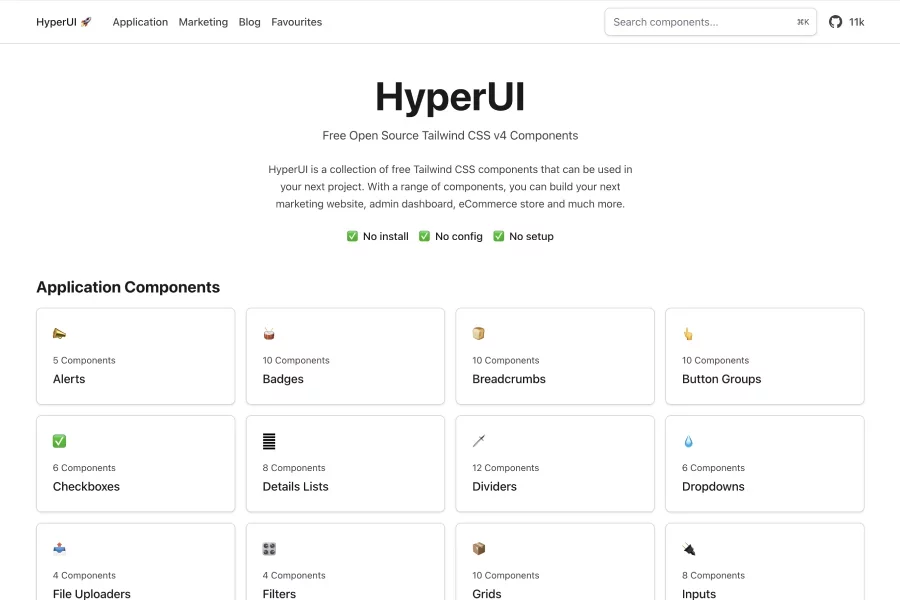
A free open-source library of Tailwind CSS v4 components — ready-to-use HTML + CSS for marketing sites, dashboards, eCommerce, etc. Browse the components, copy and paste into your project.
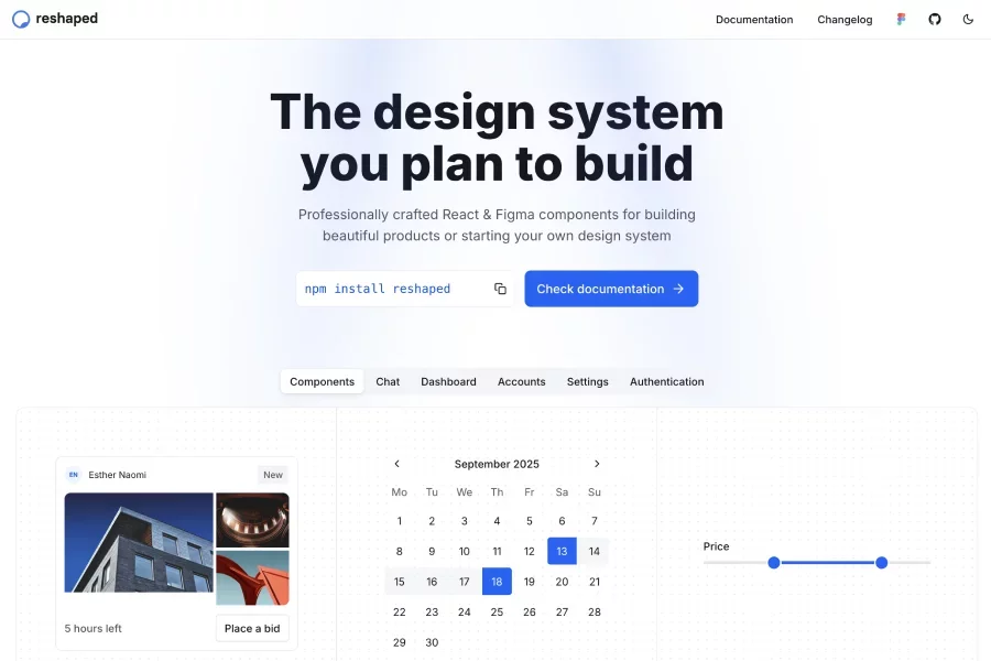
A modern design system offering both React and Figma libraries, designed for building products at scale with features like design tokens, automatic dark mode, accessibility, and theming.
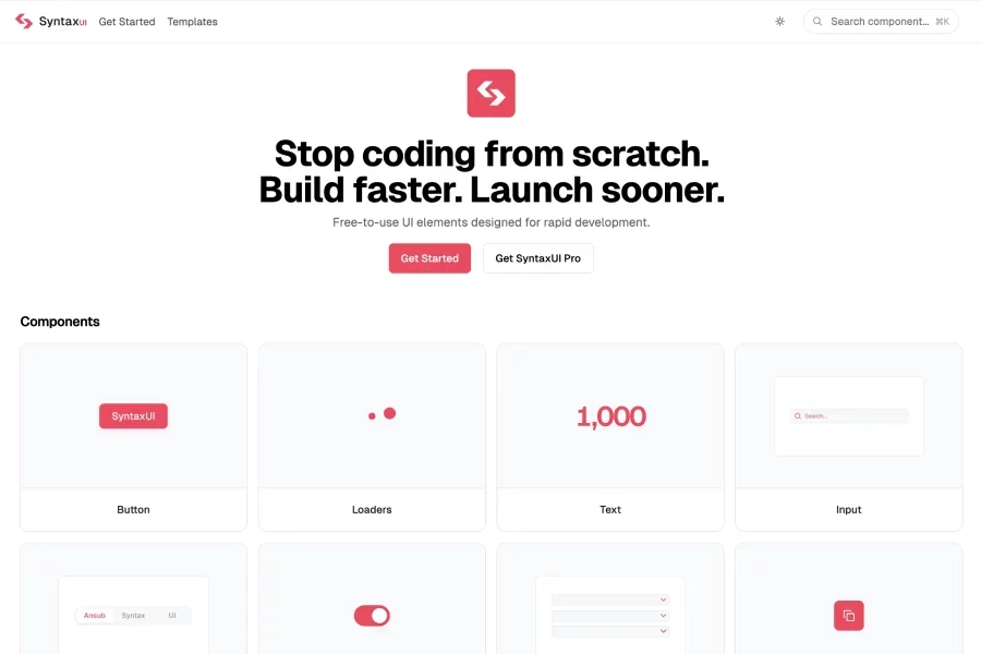
Free React + Tailwind CSS UI component library with prebuilt components, animations and blocks for faster front-end development. Includes interactive effects (via Framer Motion), templates and customizable components to help devs “copy-paste” and build UI quickly.
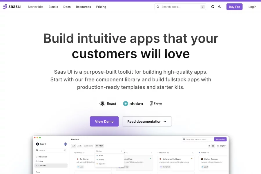
A React component library + starter kits for building SaaS-style apps quickly, with production-ready templates and reusable components. Focuses on app speed, usability, and startup-friendly toolsets to help devs/designers ship dashboards, internal tools, etc.
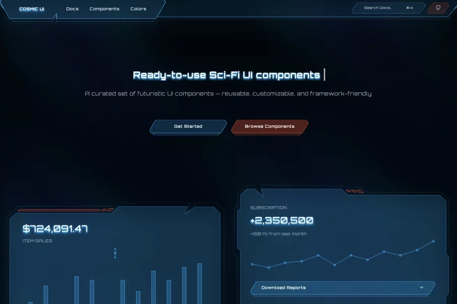
Sci-fi / futuristic themed UI component library: components with customizable SVG shapes, free & open-source, built for modern web apps. Made for designers/devs who want styling with a space / high-tech aesthetic.

Blocks & components built on top of shadcn/ui; extends it with more premade UI sections you can use to assemble pages quickly. Useful for devs/designers who already use shadcn/ui or want modular React-friendly components.
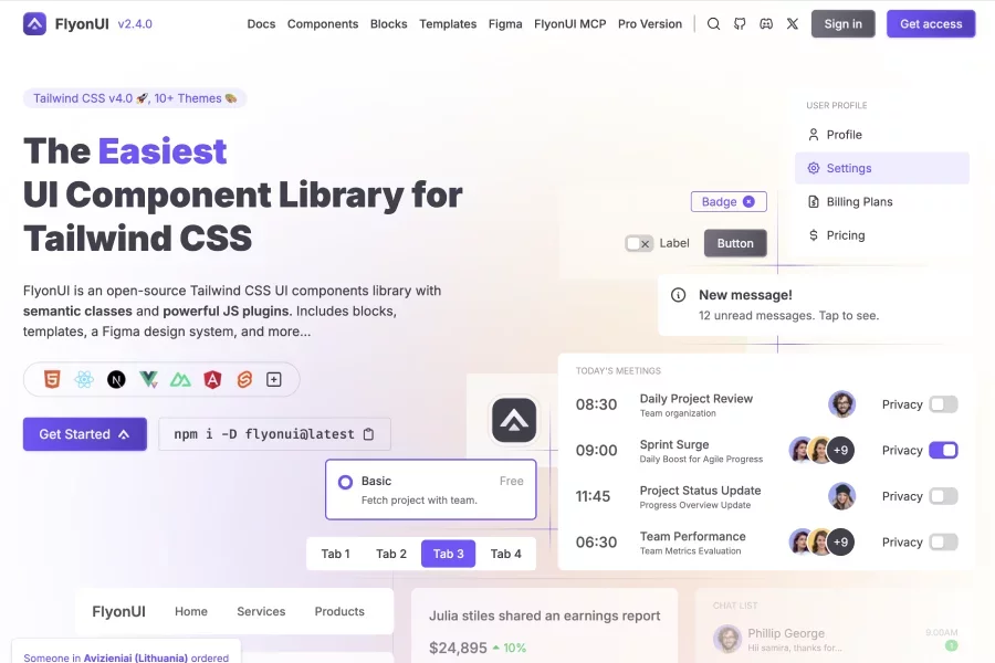
FlyonUI is an open-source Tailwind CSS UI components library with semantic classes and powerful JS plugins. Includes blocks, templates, a Figma design system, and more
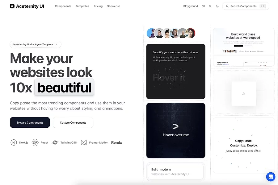
Tailwind + React + Next.js + Framer Motion based component toolkit / templates; allows copy-paste & customization so you can build good looking websites quickly. Trendy components, often animated/styled; includes premium component packs & templates.

A collection of beautifully designed Tailwind CSS components and templates; focuses on responsivity, dark mode, and support for RTL languages
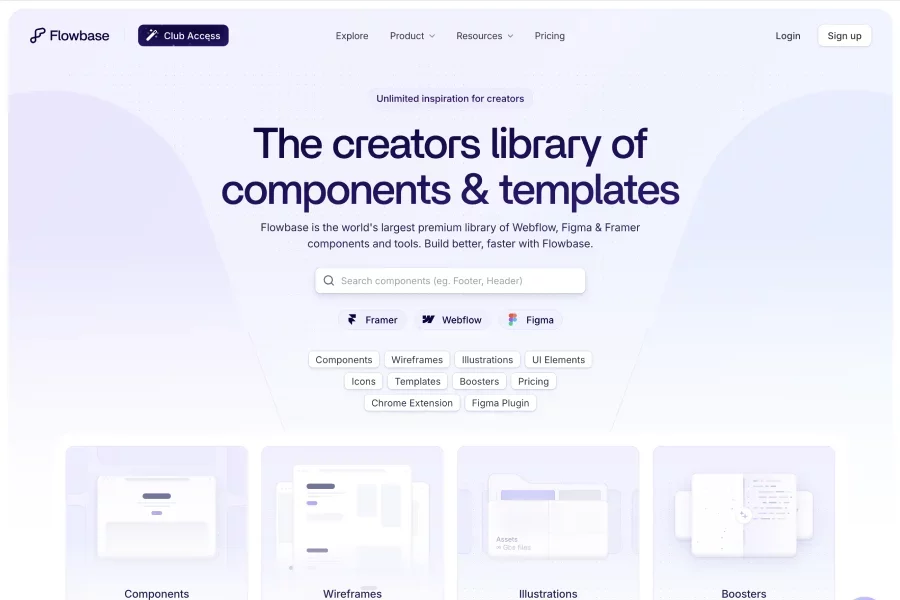
Large library of components, templates, UI elements, wireframes & icons for Webflow, Figma & Framer; includes both free and premium offerings.
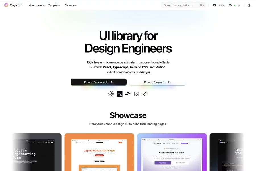
150+ free & open-source animated components built with React, TypeScript, Tailwind CSS & Motion; made especially to pair nicely with shadcn/ui. Includes templates & effects for landing pages; offers both components and template packs to speed up frontend builds
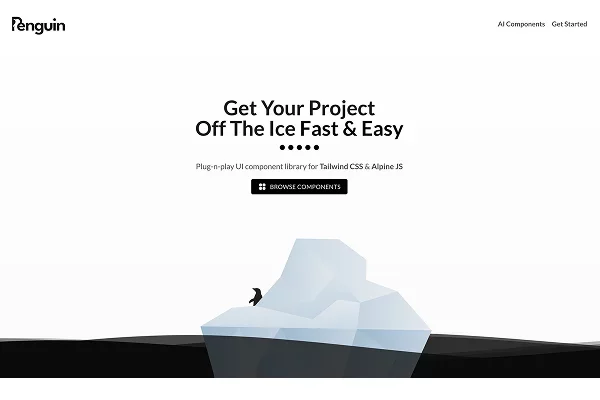
Plug-and-play UI component library built for Tailwind CSS & Alpine JS; strong focus on ease-of-use, prebuilt themes, responsiveness & dark mode support. Customize theme colors etc
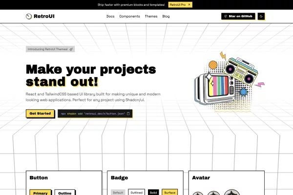
Retro-styled React + TailwindCSS component library for building unique, playful UIs (non-generic look) while still leveraging modern tooling. Components are meant to be visually distinctive with a retro aesthetic but fully usable in modern apps
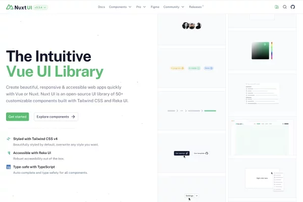
The Intuitive Vue UI Library Built with Tailwind CSS and Reka UI. Create beautiful, responsive & accessible web apps quickly with Vue or Nuxt. Open-source UI library of 50+ customizable components
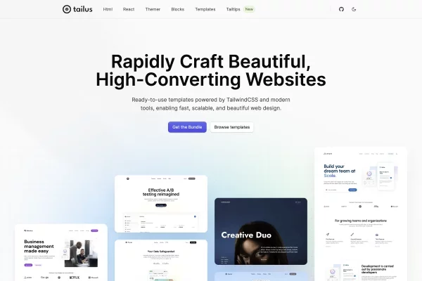
Collection of ready-made templates, blocks & component kits built with TailwindCSS for HTML, React, etc., helping speed up building marketing sites, dashboards, etc. Includes Themer (for theming), accessible & responsive designs, dark mode
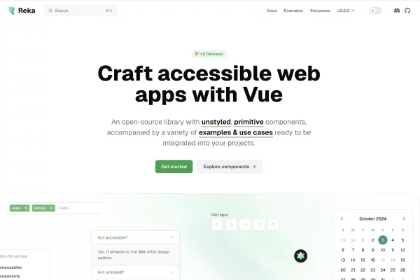
Unstyled, primitive Vue component library focused on accessibility, WAI-ARIA compliance, RTL support; meant to be a foundation you style yourself. Rich developer experience: lots of examples & use cases, integrates well in Vue/Nuxt, many components, open source (MIT)
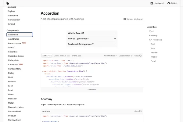
Unstyled, headless UI component library built for accessibility and customization; ideal for developers/designers building design systems from scratch. Offers primitives you can style however you like